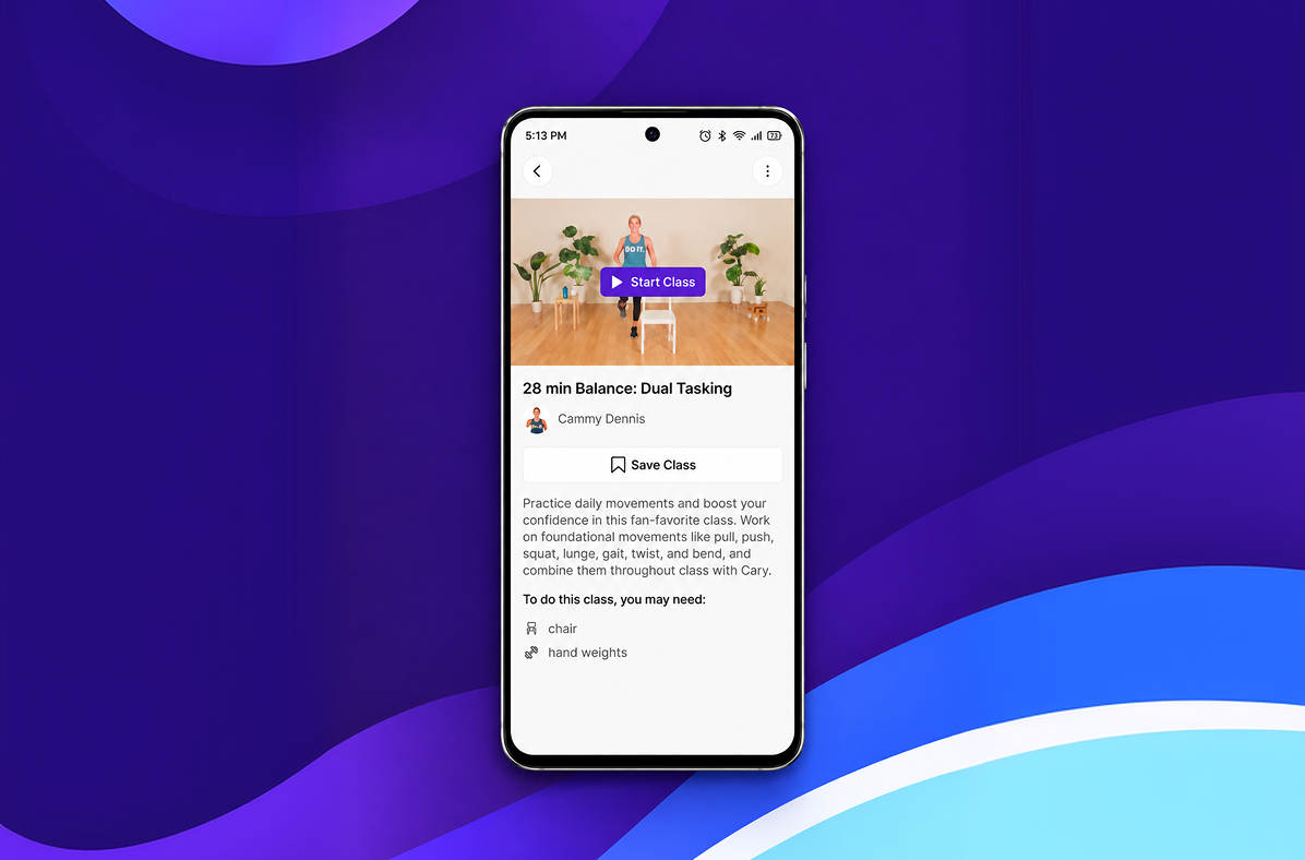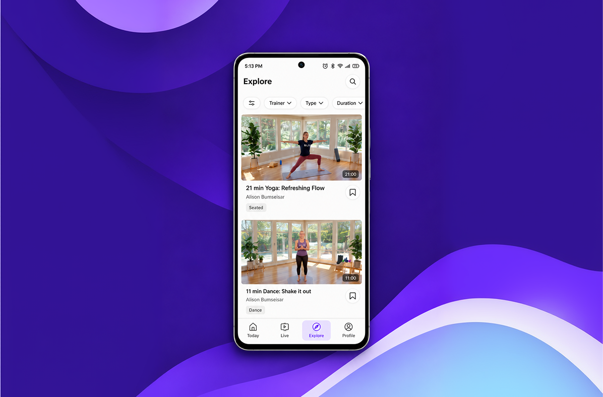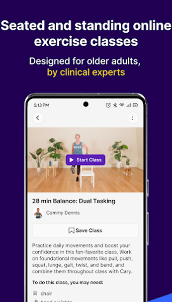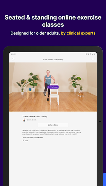

The exercise was right. The app standing between the member and the class was not.
The client runs balance and strength programmes that reduce fall risk in older adults, with real
clinical grounding. Their problem was purely the software: members in their seventies were
dropping out at the sign in screen, never mind the workout.
What we built
ACCESS
Signing in without a password to forget
Members enter a phone number and a code, or tap a link. No
passwords, no memorable words, no email loop, and the session
stays signed in on the device for as long as the member wants.
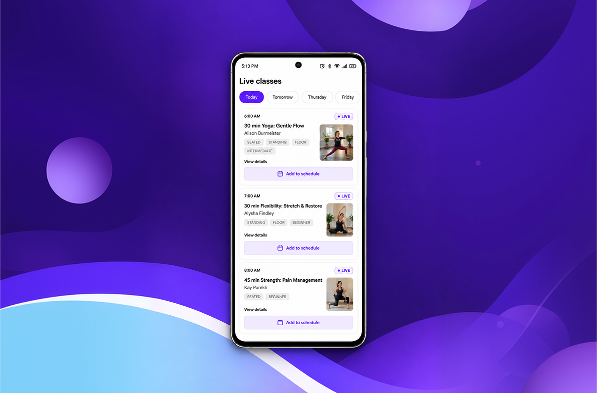
LIVE CLASSES
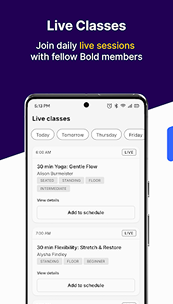
A class you join by tapping one large button
The next class sits at the top of the home screen as a single wide
button with the coach name and the start time. Nothing else on
that screen competes with it.
ACCESSIBILITY
Built for hands and eyes that are not twenty five
Every control is at least 60 points tall, text starts at 20 points and
scales further with the system setting, and video controls stay on
screen instead of hiding. Captions are on by default.
A signature detail
We tested with real members before we wrote the second screen
Rather than designing the whole app and testing at the end, we put a
two screen prototype in front of eight members in the first fortnight.
Half of them tapped the class card instead of the join button, so we
made the whole card the button. That one change came out of a
fifteen minute session and shaped every screen after it.
Thirty minutes on a call and you leave with a build plan, a timeline and the plan that fits. No obligation, and we will tell you if we are the wrong team for it.